You are using an out of date browser. It may not display this or other websites correctly.
You should upgrade or use an alternative browser.
You should upgrade or use an alternative browser.
Actually, I tried that but I thought it didn't look as good as the simpler logo. I can post a pic tomorrow ")
I think I looks to crammed with these lines colliding with the letters and I didn't want them to be any smaller.

A red highlight on that engraving would make it pop. Your cube measure line. You know the one I mean....
Can you add colour?
Can you add colour?
A red highlight on that engraving would make it pop. Your cube measure line. You know the one I mean....
Can you add colour?
You can't laser engrave a color by default, I believe there are certain paints, but those I think are for metals.
What you could do is engrave the logo en then to a lasercut that doesn't go all the way through, that would give a highlight.
Alternatively, do the engraving, put masking tape on, lasercut the edges, remove masking tape on the inside, spraypaint. Should give good results if the masking tape doesn't burn up or melt
Alternatively, do the engraving, put masking tape on, lasercut the edges, remove masking tape on the inside, spraypaint. Should give good results if the masking tape doesn't burn up or melt
That is a good idea, I wouldn't worry about the masking tape burning or melting, but it would require some trail and error. How much power is needed to cut through the masking tape but not start cutting into the wood? Alternatively I would suggest cutting a stencil that you lay over the engraving and then spray paint, cut once and use it multiple times.
I think for the first prototype I'll just leave out the paint and see what it looks like.
And no, sorry I didn't understand that oneYou know the one I mean....
So, you have the cube like that engraved on the front, right.What do you think of an engraved front?
Then make some red, inlay or paint:

With that red line. I have been thinking of that as the logo of this case.
I'd put the red line on the three rightmost edges or on the three inner ones. Having it like you propose makes it look wonky, but I do see how it gets the message across better.
That was only "to get the message across"I'd put the red line on the three rightmost edges or on the three inner ones. Having it like you propose makes it look wonky, but I do see how it gets the message across better.
I'll see if I paint some parts of the front logo later on.
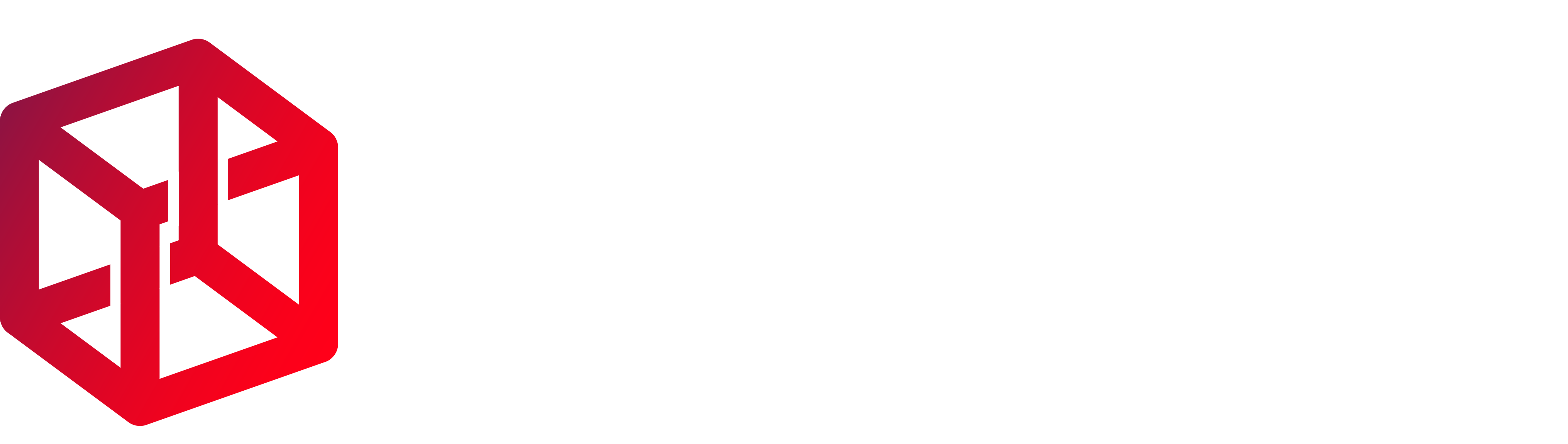
As I read through the latest ideas of you guys I made some more renderings of different aproaches:
New Logo Black/White:

New Logo Black/White/Red outline:

New Logo Black/Red:

New Logo Black/White/Red outline:
New Logo Black/Red:
Tell me what you think about it and which (including the the "old one") you liked most
I concur, the first one looks the best. The old one was a bit heavier, this lighter version suits the case better.
Red doesn't really fit in the rendering at all.
Red doesn't really fit in the rendering at all.
I personally like the first of the three the most. It does look better without the filled-in sides (original logo) to me.
I like the New Logo Black/White best as well. This one is feels simpler and not as 'heavy' as the fully filled in version.
I played with your image a bit, and did this, sort of borrowing on what Kip had said, and I think I stumbled upon the thing that keeps bothering me (it's probably just me)...

Anyway, I think it's the isometric view that is bothering me for some reason. I realize that it's not as easy to show the actually-a-true-cube nature of the project with a perspective view, but isometric just looks off to me. The other thing that wasn't apparent to me until I took away the outlines is that the letters are pointing 'down' (as a result of the isometric view). With the lighter-weight outline, from a distance (or in a thumbnail image) it might look better for the letters to aim 'up'. That, unfortunately, also introduces its own problem in that the isometric view is now showing the 'bottom' of the cube.
Anyway, just my random thoughts.