Are the feet and io placement the only changes with this revision?Everything is mine except the feets.
Lian Li/DAN A3-mATX
- Thread starter dondan
- Start date
You are using an out of date browser. It may not display this or other websites correctly.
You should upgrade or use an alternative browser.
You should upgrade or use an alternative browser.
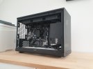
Here are two pictures of the current prototype. The front will be changed so you cant look through the glass.


I have to say I really don't like the feet. I think the plastic base from the previous version is a million times better. Those metal bars look really weird and do not match anything else on the case.
I'm also not sure about the glass front, whether you can see through it or not. Again, I think the vertical slatted front from the earlier version looks better. Is an open front with fan mounts completely out of the question?
The overall design though is looking really good. I'll probably buy it whatever it ends up looking like (assuming it's available in silver).
Last edited:
Agree on the mesh front, and different legs
Also colour option, like green, cooper or yellow/black. White/Silver is getting boring
Also colour option, like green, cooper or yellow/black. White/Silver is getting boring
can you share the reason for this change? personally I wouldn't mind seeing through the glass to the components inside hahaThe front will be changed so you cant look through the glass.
EDIT: and on the contrary to some opinions here, the feet is actually a distinction from majority of cases so I don't mind that either.
I have to say I really don't like the feet. I think the plastic base from the previous version is a million times better. Those metal bars look really weird and do not match anything else on the case.
I am also not the biggest fan of them. Maybe i can convice LianLi to chabnge them.
I don't like the glass front, It should be mesh. Those feet... what happened. They do not look appealing at all..
The case has more than enough mesh. The front should look different
The feet are out of place here and don't fit with the rest of the case whatsoever. I hope Lian Li sees that and decides to change it. The front panel can be windowed or solid, doesn't matter that much. The easiest way to put it is that this case looks like an even larger NR200, with the raised feet mod, and supports 4000 series graphics cards.
Can you say what the final dimensions are going to be?
I think something like this version of the feet would suit it perfectly.

I am also not the biggest fan of them. Maybe i can convice LianLi to chabnge them.
I think something like this version of the feet would suit it perfectly.

I want to reinstate my concern from Months ago. I really liked the vertical GPU mount in front of the CPU is there a reason why it went away? Because of this feature I started watching this the evolution of this case and I am currently torn to the sliger mATX case because I can build such a feature based on their changeable backplate myself.Where did the option go to mount the GPU in front of the CPU? This was the main selling point for me because it gives the option to utilise the full capability of mATX even with a thicker GPU. If this option goes away there is no real benefit for me in relation to an ITX case and board.
In fact I liked the original grey design with less mesh and the rippled front much better. Don’t get me wrong the current one is also quite nice but not what I expected from the first and in between posted designs.
Similar threads
-
- Article
- Replies
- 6
- Views
- 6K
-
- Article
- Replies
- 0
- Views
- 6K
- Replies
- 9
- Views
- 16K
- Replies
- 3
- Views
- 2K


