Alongside the launch of SFF Network, we're excited to also announce a bunch of changes and new features that have been added to our existing community, SFF Forum. We've been working on these updates for some time, and couldn't be happier with how well SFN 2.0 has turned out!
To be honest, that there are just too many changes, big and small, to summarize in a single article, and your best bet to learn about about everything new is to simply use the forum for a while. But I'd like to mention some of more substantive changes we've made, for today's reveal, just so you have a sense of the scope of what's changed. So, in order:
A new brand and UX
Although SFF Forum only went live around six months ago, the styling and structure of the site throughout that period left much to be desired, and didn't fully utilize a lot of the functionality provided by the modern platform we'd built the site upon. Because of this, we've moved the entire forum to a brand-new UI framework, and have invested considerable time adapting everything to the new SFF Forum brand. The result of this: a responsive, modern, and highly functional forum, that we think blows most others out of the water, and should remain bleeding-edge for some time to come.
Of course, the aesthetics alone are a fairly dramatic change, and we're quite happy with the more modern and bold aesthetic that we've managed to create. But the functionality of this new interface is just as important, and was far and away what we spent the most amount of time working on. Just to illustrate some of these new features, here's a helpful screenshot:
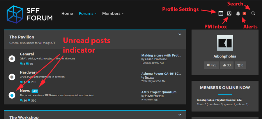
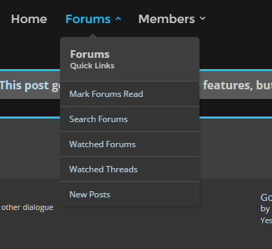
From here, you can immediately see some of the functional changes that appear on the home page, many of which generally extend throughout the forum. There are now some great, highly-visible new post indicators, for example, that make it easier to stay on top of updating threads. The user bar in the top right has been reduced to icons, in order to save precious vertical space. Hovering over those icons now opens contextual menus on-page, so you can quickly preview those sections, and click on them to open the full page. And a simple search box is now accessible via the magnifying glass icon in the top right.
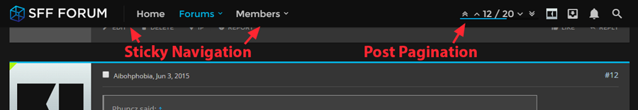
As you navigate to a forum thread, a particularly handy feature that we've enabled site-wide is the sticky navigation menu, which remains at the top of your browser window as you scroll down a page. It's essentially a compacted version of the top nav menu, but its persistence enables quick access to the menu and user bar, and ensures that you'll see incoming notifications, to boot. You also gain access to convenient post pagination controls, which give a visual indicator of your place within the page, and provide arrows that let you quickly jump up or down through posts (or let you go to a specific post directly).
Of course, there's many other little details in the new design that we hope you'll enjoy, but you'll have to discover them for yourself!
A new, more secure URL
Navigating your web browser to sff-forum.net will still send you to the right place, but moving forward, the primary domain for SFF Forum will be https://smallformfactor.net/forum. In addition, and in keeping with our philosophy of respecting privacy and security, we've enabled SSL across the entirety of our web properties. Although we aren't a high-risk online resource (like a commerce site), nor do we deal heavily with private information, we think that the community will be contented in knowing that all traffic between our servers and our users' computers is 100% encrypted, end-to-end. Furthermore, we're even using the modern SHA-2 SSL certificate, in place of the soon-to-be-deprecated SHA-1 standard, for a more secure connection.
Integration with SFF Network
SFF Forum already has a News subforum where users can contribute and discuss articles, but we're taking the section to the next level by tying all SFF Network posts directly to conversations on SFF Forum. Each article on SFF Network, in fact, will have a forum thread that will act as its comments section (similar to HardOCP and HardForum), and these threads will co-exist alongside all of the user-contributed content that's posted in the News subforum. In this way, all of the great things about the forum - including the rich posting features and the embedded community - can culminate in informative, compelling, and healthy dialogue surrounding the latest developments in the SFF space.
Additional subforums
Finally, we've also added a few new subforums to SFF Forum proper, and will likely continue to add more granular categories as the community continues to grow. Some of the newest include our Modding subforum, as well as our Introductions subforum, where new members can (predictably) introduce themselves, and get to know everyone in the community. But we're continuing to consider additional sections, and look forward to fielding suggestions from the community moving forward.
All-in-all, there's lots to love, and we can't wait to see how the community will leverage all of this new stuff! We're already looking ahead to future changes and additions in the development pipeline, but we've had a lot of fun implementing all of these improvements, and hope you all will get just as much enjoyment from them as we have.
Of course, if you have any questions or feedback regarding these changes, you can (as always) post in the Feedback subforum, or contact us directly on the forum itself - such as on this thread!